Work
Four projects and what went into them.
The baseline
Every site here is built to the same baseline: accessibility practices aligned with WCAG 2.1 Level AA, structured data describing the business and what it offers, and content organized so search engines and AI assistants can read and quote it accurately. That part is standard. The notes below cover what was specific to each project.
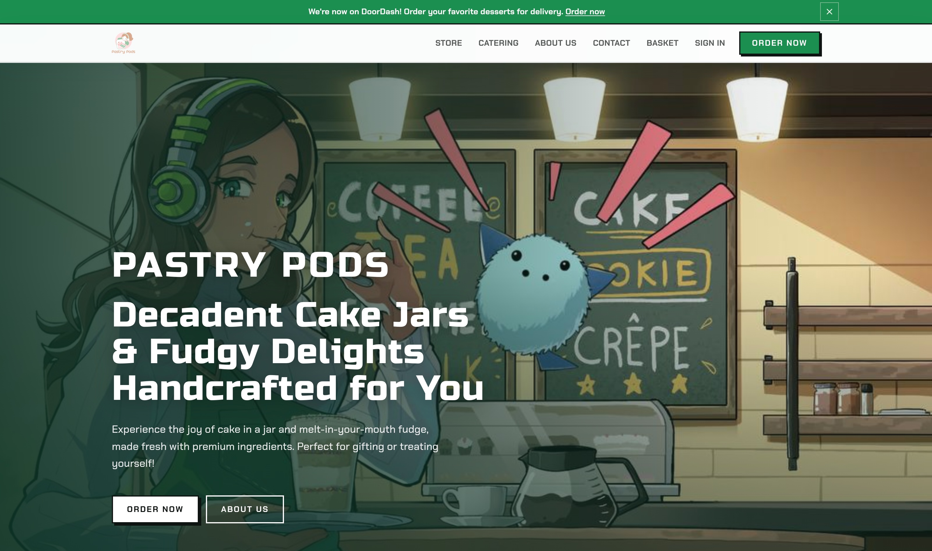
Pastry Pods
A direct-to-customer pastry business selling jarred desserts. A full online store: storefront, product pages, cart and checkout, payment connection, shipping and tax rules, and order notifications. Product data is structured so each item carries its own price, availability, and detail, which is what lets listings appear correctly in search results rather than as undifferentiated pages. The catalog belongs to the owner. Adding a product, changing a price, or marking something sold out takes a couple of minutes in the dashboard and needs nobody's help. Goodform runs everything under it, including the checkout path, which is monitored separately from the rest of the site because a store that loads fine but cannot take payment is still closed. Built on the Goodform store template, which is where the speed comes from. The commerce layer already existed and had been tested, so the work was configuration and content rather than construction.
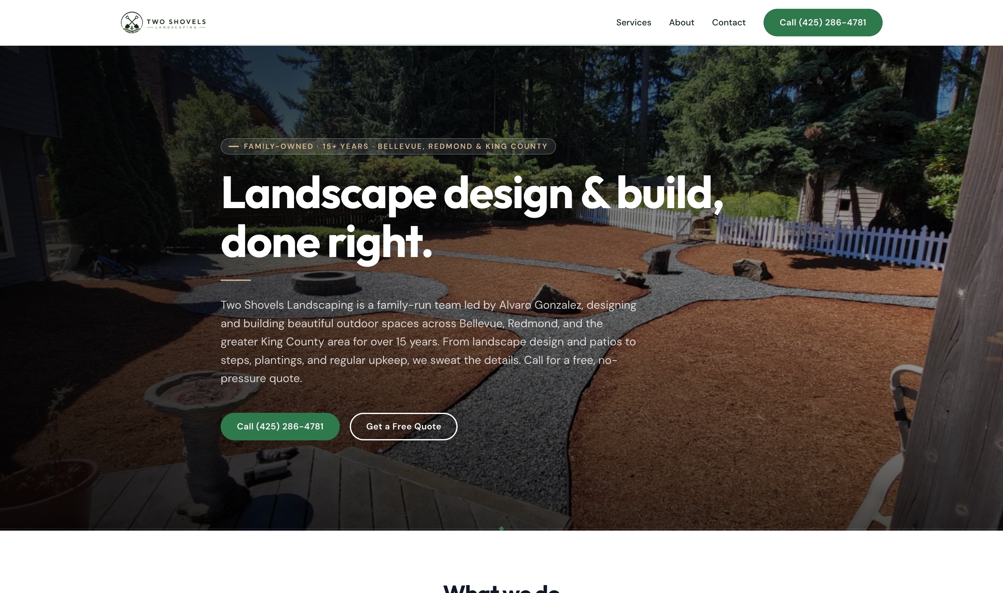
Two Shovels Landscaping
Family-run landscape design and build, serving Bellevue, Redmond, Kirkland, Sammamish, Issaquah, Woodinville, and the wider King County area. Logo and brand identity designed for the business, then carried through the site. A single-page site covering services and service areas, with a mosaic photo gallery, a before-and-after project slider, a quote form, and a connected Google Business Profile. The before-and-after slider is operable by keyboard, not only by dragging. Most comparison sliders are drag-only, which leaves the second image out of reach for anyone using a keyboard or a screen reader. This one responds to arrow keys, announces its position to assistive technology, and meets touch target size on mobile. The gallery and the slider were built as reusable components rather than one-off code.
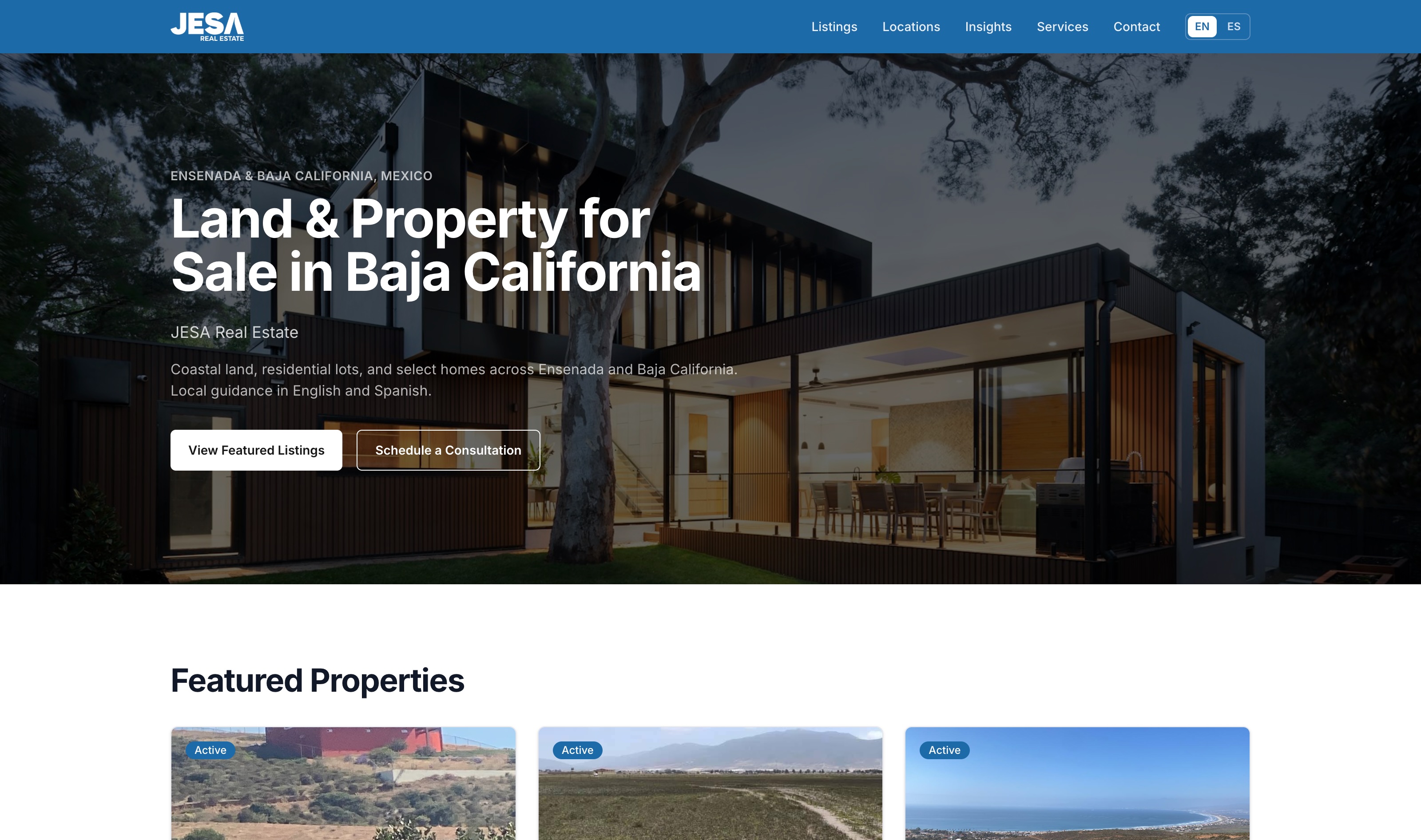
JESA Real Estate
A real estate agency in Ensenada, Baja California, working with local and cross-border buyers. Logo and brand identity designed for the agency, then carried through the site in both languages. A full property site with listings, buyer guides, navigation and footer, legal pages, a sitemap, and a Spanish version of the site. Listings are structured records rather than pages. Each property holds its own fields for price, location, and detail, so a listing can be added, revised, or marked sold without touching layout or code. Every listing comes out with the same structure underneath, which is what lets the inventory be read as inventory rather than as prose. The buyer guides answer questions specific to purchasing property in Mexico, the kind that get searched long before anyone contacts an agent.
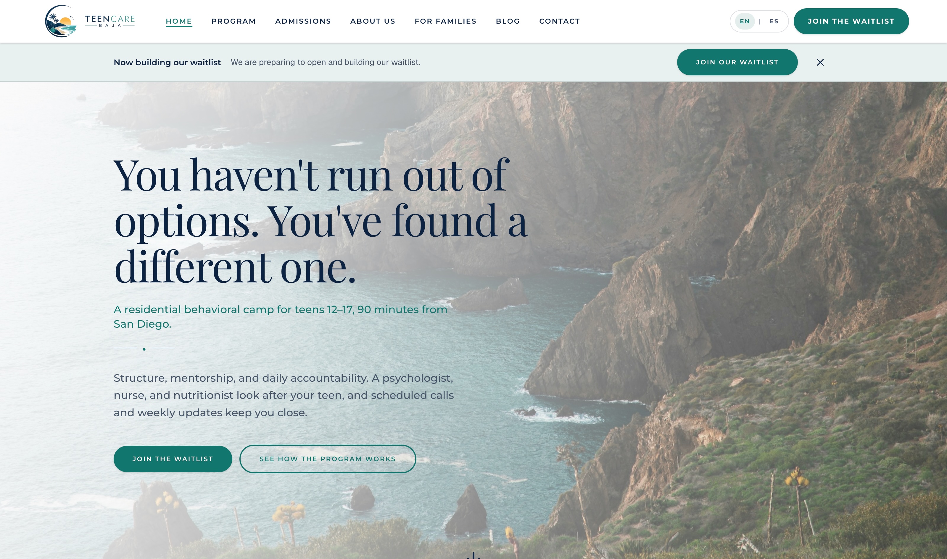
Teen Care Baja
A residential behavioral camp for adolescents in Baja California, serving families in the United States and Mexico. A full bilingual site in English and Spanish, with program and staff pages, an intake path, legal pages, and a launch set of articles. The Spanish version uses formal usted throughout, which is the register families expect on a site like this one. Both language versions carry their own structured data, so the program is described accurately whichever one gets read.
Want something like this?
Websites, online stores, email, Google, social. Tell us what you need and you get a written quote within five business days. No sales call.